
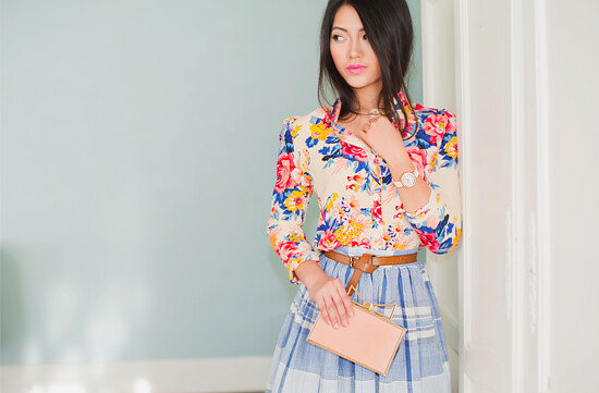
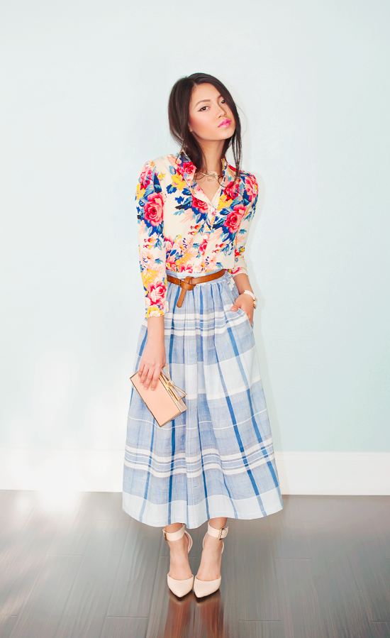
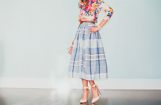
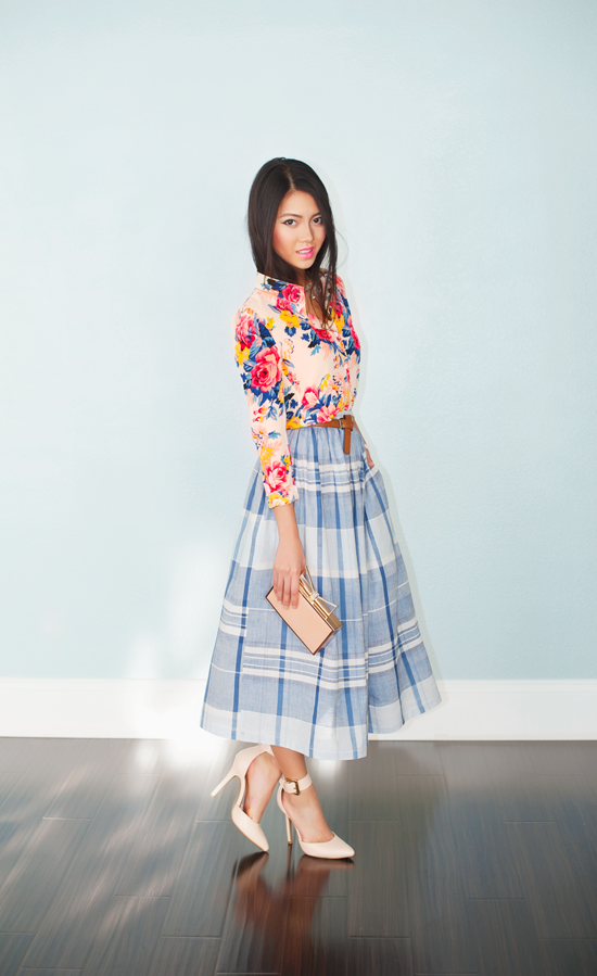
< vintage skirt thrifted similar here and here // top this one works too here // clutch c/o lulus // watch anne klein >
Repeat colors.
The most essential thing to remember when you're mixing prints is that the prints should have at least one color in common. Repeating colors is the way to help prints complement each other instead of clashing. Colors can pull two completely different prints together and make them look like they were made for each other!
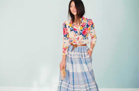
One way to repeat print colors is to choose two prints with the same dominant color. For example, you might have a lime green-striped skirt and a paisley with a lime-green background.
For a slightly bolder look, choose a less dominant color from one print and match that color with your second print. For example, if you have an ikat print with a touch of rose, pair it with a rose-colored plaid.
The colors don't have to match exactly, but they should be close enough that it's clear they are meant to go together.
Pick a big print and a small print.
If you have too many prints in the same size, your outfit or home decor could end up looking busy. Think of prints in terms of their size, and choose a big size and a smaller size to go together. Having prints in a range of sizes creates visual harmony instead of headaches.
For example, if you have a skirt with a large floral pattern, try pairing it with a thin-striped top.
If your couch has a big plaid pattern, use throw pillows with a smaller print.
Follow the 60-30-10 rule.
If you're mixing three different prints, aim to have the largest print take up 60 percent of the look, choose a medium print to comprise 30 percent of the look, and have the smallest print make up the last 10 percent as an accent. This balances the overall appearance of the prints and keeps them from being too overwhelming.
For example, you might wear a maxi skirt with a large floral pattern, a mid-top with a medium stripe print, and statement necklace with a small colorful print.
In your home, try pairing wallpaper with a big, bold print with a chair or sofa with medium print and accent pillows or lamp shades with the smallest print.
Use a solid to break up prints.
Sometimes two prints that would otherwise clash need something solid to break them up. Choose a solid color that matches both prints and feature it prominently in between the prints, rather than having the prints layered on top of one another. This gives the eye a chance to rest instead of jumping back and forth between busy prints.
Mix two similar prints.
Prints that are similar in scale but come in slightly different colors can layer beautifully. This is a great way to mix prints if you're after a more conservative, monochrome look that works as well in the office as it does on a weekend.[2]
For example, if you have a peach and white polka dotted top, trying pairing it with a black and white polka dotted skirt.
At home, try working with 2 - 3 different plaid prints in one room.
Mix bold patterns with low-contrast patterns.
Another great way to incorporate a variety of prints is to choose one that's bold and another that's low-contrast, such as a neutral-toned ikat print. This allows you to create an interesting, finished look without too many overwhelming colors or prints.

Your shirt is so pretty! I wish I could find cute pieces like that at the thrift store!
ReplyDeleteroseylittleme.blogspot.com